
UI/UX case study
Modern Fintech Dashboard
Data-rich finance interface
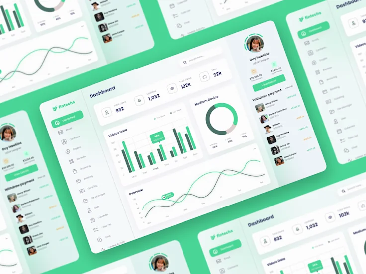
A finance dashboard concept that organizes balances, activity and decision-supporting data within a clear product interface.
- Dashboard UX
- Financial data
- Product UI
- Responsive hierarchy
01 / Overview
A focused interface
built around clarity.
A finance dashboard concept that organizes balances, activity and decision-supporting data within a clear product interface.
- Discipline
- UI/UX & Product Design
- Format
- Public portfolio showcase
- Source
- Junaid’s public Fiverr portfolio
- Evidence
- Supplied interface preview
What the interface needed to solve.
Financial interfaces have to surface important information quickly without making a dense product feel difficult to operate.
How the design creates direction.
The design groups related data, establishes clear visual priority and uses repeatable interface patterns across the dashboard.
04 / Interface evidence
The work itself stays
at the center.
The supplied preview is presented at full clarity inside the NexSolve case-study system. No user, revenue, conversion or product-performance result is inferred from the visual.
Open the public portfolio source ↗05 / Design focus
Four priorities visible
in the system.
Dashboard UX
A documented focus area represented in the supplied interface work.
Financial data
A documented focus area represented in the supplied interface work.
Product UI
A documented focus area represented in the supplied interface work.
Responsive hierarchy
A documented focus area represented in the supplied interface work.
Evidence standard
Published with clear attribution.
This case study documents previous independent UI/UX portfolio work connected to NexSolve design practice’s public Fiverr profile. It is not presented as an unsupported NexSolve corporate-client result.
Your product
Need a clearer
digital experience?
Bring the product idea, existing workflow or interface challenge. We will help define the right design starting point.